


Win it for Lizzie
A very serious look at the plans for the Queen Elizabeth Memorial in London

Right now, a coterie of huge architectural egos is facing off to create the official memorial for Queen Elizabeth II, just east of Buckingham Palace on a strip of St. James’s Park running roughly North to South.
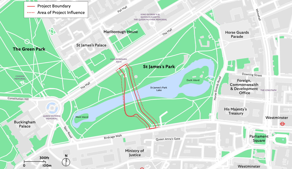
The route starts at Marlborough Gate on the Mall before crossing the heavily used, if somewhat unremarkable, Blue Bridge that spans the Park’s lake. This is a popular spot for photos with views of the Palace to the West and Parliament to the East.

St James’s Park began life as a royal hunting ground before it was converted into a formal garden. In the early 1800s, architect John Nash gave the park a makeover, which is largely intact today. Nash’s design drew on the picturesque, eschewing the artificial formality of European parks and gardens for something more like simulated nature, converting the Park’s canal into a rounded lake and ditching the straight-lined promenades and hedge rows for curves and winding tree-lined paths. Five teams are competing to put their stamp on this landscape with the Elizabeth Memorial.
Competitions are common in the architectural world, although they are generally not open to the public like this one. I experienced a few architectural pitches as a planning consultant. My company was the subsidiary of a large architectural firm that would partner with us on urban-scale projects — basically anything bigger than a single building. The smallest project I worked on was a couple of office buildings in London and their attached roads and sidewalks; the biggest was a master plan for the extension of a Gulf-State city that was meant to hold 2.5 million people (realistic!). Working on these projects gave me a little window into the punishing nature of the architecture profession and an insight into some key differences between the professions. Unlike planners, successful architects have the veneer of an artist, the cover of creative genius, and all its attendant powers. The most successful architects I observed were also the best storytellers. They could put their arm around a client and reassure them that the massive amount of money they were about to shell out was well spent by appealing to their brains, yes, but also their feelings, and especially their egos and ambitions. They were salespeople in a way I haven’t really seen in the planning or placemaking community.
Let’s start with the starboy of the Elizabeth competition — Thomas Heatherwick. Americans probably know Heatherwick for the giant waste basket sculpture/building called the Vessel in Hudson Yards (now with fewer suicides). Across the pond, his reputation is more diverse. He’s designed the Google HQ going up at Kings Cross and the beautiful, but doomed, Routemaster bus (which I’ve written about). Heatherwick is an accomplished billionaire-whisperer and yarn-spinner. In the competition video, he is seated in an actual studio surrounded by material samples… very artist-at-work.

He opens his pitch: “Our masterplan is a physical manifestation of what our research seemed to say the Queen really stood for…togetherness and unity,” which is about as bold as saying Bugs Bunny stands for mischief. Suggesting these values were arrived at after some kind of unspecified “research” is even better. I contributed to this type of thing all the time. With my background in marketing, people were happy for me to put a slide at the start of their presentation that said something like: This project isn’t just about an office… It’s about a new paradigm in connection, or the values of this (luxury resort) are transparency and achieving a new state of being. Anything to convince people the design was serving a higher purpose. In this case, that’s not a hard sell — it’s a memorial to the Queen. Heatherwick’s plan centers on a meandering path made up of a series of “lilypads” designed by the artist Halima Cassell.

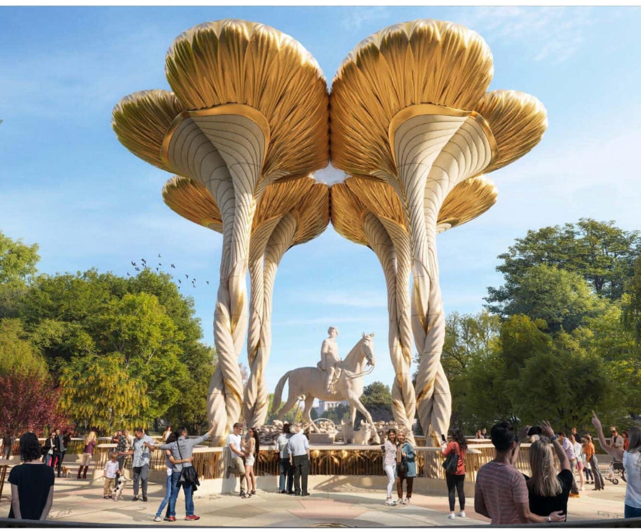
70 lily pads line the path, climaxing in four raised pedestals that surround an equestrian statue in the middle of a bridge. Each lily pad has a different quote or aspect of the Queen’s life. This is a theme across the competitors: fitting the Queen into something that feels singular but also has space for the breadth of her experience.
In the other corner is Norman Foster’s proposal. Foster is the most commercially successful architect ever, and I think generally deserving of his good reputation. He is the rare architect with both a house style and a track record of tactfully fitting buildings into historic context (his renovation of the Reichstag, Hearst Tower, and the British Museum Great Court, for example). I would imagine this gives him a leg up, as well as the fact that he is a literal Baron, which you would think would count for something in a Royal memorial. But as far as I know, Foster has never designed a park or public space of much note, with the exception of the pedestrianization of Trafalgar Square.
Foster is also a master salesman. Long before I even worked in planning, when I was a brand strategist, I circulated this video of Foster explaining a proposal for a tower on Park Avenue as an example of a great pitch presentation to my office (no PowerPoint, no notes, all physical props). Interestingly, he spends much of the competition video talking about the entrance and exit of the memorial path, slightly demphasising the bridge, which was the singular focus of Heatherwick. Foster places an equestrian statue of the Queen not quite in the park, but on the National Mall, marking the entrance to the memorial path. It’s a smart way to put her on one of the most heavily trafficked routes in the city. You can imagine red-coated soldiers and Horse Guards marching past it on holidays, something Foster explicitly leans into in his submission renderings. He’s not the only one to pull this move, the submissions by finalists J&L Gibbons, Tom Stuart-Smith, and WilkinsonEyre also place statues on the Mall.
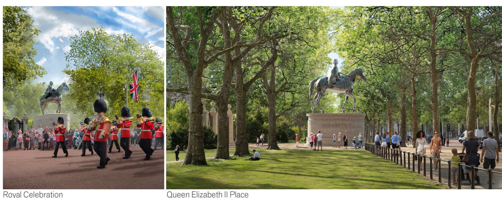
This is the kind of difference I imagine inspiring endless debate amongst judges. Should a statue be present on the National Mall to fit the existing pattern of the area’s use? Or should her memorial be a singular moment in the middle of the park? Should you be able to stroll past the memorial and see it, or should you be forced to come into it? In my limited experience, the architects I found to be the most successful at the urban scale understood the rhythm of a place and the limits of their ability to change it. The designers placing a statue on the Mall know its meaning to the city and are making an accommodation. The ones who aren’t, like Heatherwick, may be going for something more artistically pure, but less aligned with their surroundings.
The ‘Unity’ bridge in Foster’s plan is a translucent shimmer. Like Heatherwick’s design, the path and bridge are engraved with inscriptions from the Queen’s life. The master plan itself chops up Nash’s path into a family of gardens with plantings from across Britain and the Commonwealth. Nearly every competition entry has altered Nash’s path significantly to encourage people to linger, but also primarily to fit more stuff.

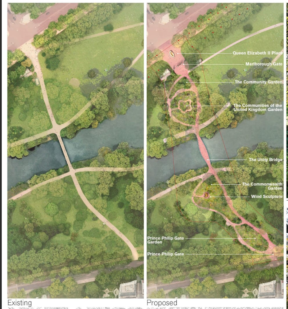
A lot of this “stuff” is commemorative pieces of art or sculpture. Contemporary architecture has an allergic reaction to decoration, ornamentation, or anything too literal, so it’s interesting that despite a few whirlly shapes and abstract representations of the Queen, every proposal includes a simple equestrian statue (I wonder if this might be a requirement for the competition). There is nothing wrong with this; we are talking about the Queen, not some avant-garde icon, and a statue of her on horseback is accessible and legible to a wide audience in a way the meaning of Heathewick’s lilypads or the “Wind” sculpture that’s part of Foster’s plan are not.

The one abstraction that stands out is the proposal from the landscape architect Tom Stuart-Smith, which features an exact bronze cast of a 1,000-year-old Oak tree from Windsor Castle, suspended on a plinth adjacent to the bridge.

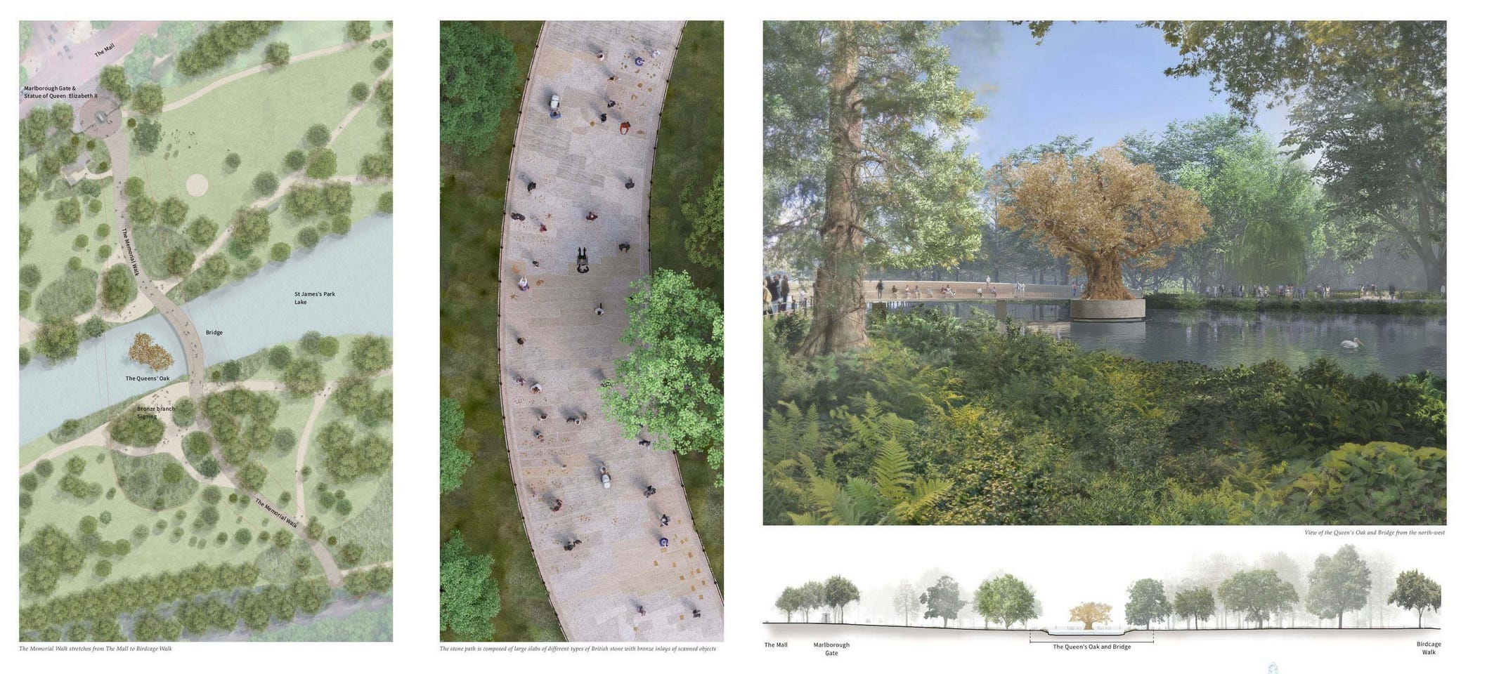
The oak was sacred to the druids who inhabited ancient Britain; a crown of oak leaves is a classic symbol of imperial authority, and there is a fun history of naming places in London after oak trees (Burnt Oak, Sevenoaks, Honor Oak). If there is one stereotype of the English I found broadly true, it is a hobbit-like love of gardens and things that grow, and a solid bronze tree feels like a suitable symbol of the stability of the Queen’s reign. Stuart-Smith’s competition video has black and white clips of the Queen as a child playing on an oak tree, then later as an adult planting trees herself. It is, in a couple of frames, a much stronger rationale for the symbolism than the design justifications used by the other competitors. History is an easy way to make a design seem like it comes from something more, and most clients like to think of themselves as building the next chapter of an established legacy. This is why Foster, in the pitch for his Park Ave skyscraper, starts with Hugh Ferriss and his charcoal drawings of Art-Deco skyscrapers, the implication is that you creating something new and classic at the same time. Almost all the competition finalists claim at the very least that their design is a respectful evolution of Nash’s historic park.
Stuart-Smith’s video continues with some gratuitous craftsmanship shots of people hand sketching and 3D modeling the tree. One thing architecture has over planning is the seductiveness of its craft. People like seeing architects tinkering with models or spinning renders around. Both Heatherwick and Foster make extensive use of physical models in their practice. Despite such things being supposedly made obsolete by VR and computer renderings, there is nothing more engaging than having the physical design in front of you (Heatherwick had a pastry chef create a birthday cake in the shape of the Vessal for his developer client Stephen Roth). I find it unfortunate that most planners, if they are taught to think spatially at all, are never taught to sketch spaces or build basic models — not just because these processes look good in competition videos but because the act of rendering a place by hand really makes you learn it.


There is a lot to roll your eyes at across these submissions (and I’ve only mentioned three of them; there are more). I’m grateful that planning is free of the types of egos that dominate architecture, but there is a lot that planners could learn from how designers and architects present work and tell stories.
A willingness to frame a proposal in terms of a higher purpose or order (although this can be done shamelessly to ill effect).
The use of history to inform design and make even bold proposals look like a natural progression rather than a dramatic remaking.
A celebration of the process and especially physical craftsmanship to humanize proposals.
How planners convince people (or don’t) of their ideas is becoming an ongoing focus of my writing. I’d be curious to know from readers what the most persuasive planning or architecture proposal they’ve seen is. And, for what it’s worth, my vote goes to the Oak tree with a nice big equestrian statue on the Mall.
"The most successful architects I observed were also the best storytellers": This is fascinating to me, as a historian--not merely that architects tell stories in order to win competitions, but that their designs tell stories too. Calls to mind a book I like my history students to read: Jonathan Gottschall: *The Storytelling Animal: How Stories Make Us Human.* Thanks for another great post . . . I mean story.
Before I got to the end of your writing, I voted for the oak tree.